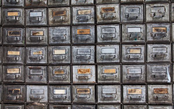
One moment, we're cooking some code examples

With the grid wrapper around the image we can style the image easier, this because the image is now in 3 parts.
First: the ImageWrapper where you can style the image like a component.
Second: Image is for the position of the image, you style this as a background.
Third we used the image to trick the SEO it has a opacity: 0; so we can't see the image.
With Border: you can give the image a border, or a border-radius: with this little thing you can make it look less sharp. And with the box-shadow: you can make the image less 2D and more 3D, This so the image will pop uit the screen more.
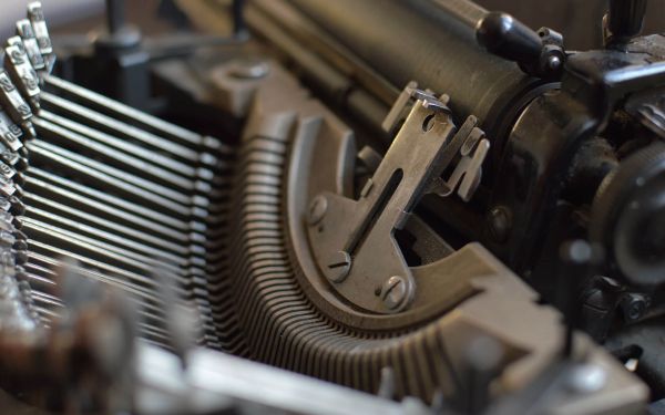

You can style images in al lot of different ways, to make the image not so boring you can make it look like a polaroid image like we did here, the image is made with a class="Polaroid" in the wrapper. And it uses a filter: grayscale(50%); to make it gray, and with hover we made it interactive.
For the polaroid you must make sure that it is rectangle by using
/w:600/h:600inside the url.
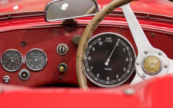
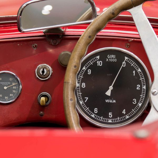
Red car interior
blur() and linear-gradientwe are adding text to a image, but to make it readable you can blur a section or use a gradient in a section of the image with blur() or we can use linear-gradient this creats a place ware the text is easy to read.


80s and 90s Hits

80s and 90s Hits
&:hoverYou can add a lot to a image with &:hover you can make it more interactive for the users, and improve the experience on your website. But you can also add more information about the image when people hover over it.
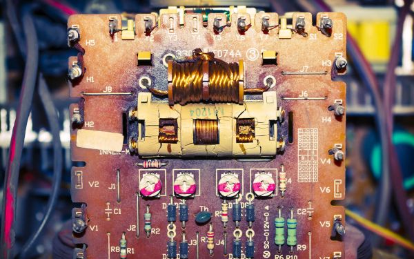

PCBs (Printed Circuit Boards) are essential in modern electronics, composed of insulating materials like fiberglass with thin layers of conductive copper traces. These traces create circuits enabling seamless communication and functioning of electronic components.
Learn moresvg maskYou can change the shape of a image with a Svg Mask you can shape the image to your liking, and make it fit the theme of the website.
to make the blob shape we used blobanimation.com
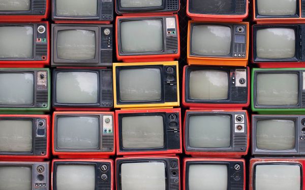


animated svgYou can change the shape of a image with a Svg Mask but you can also animate the svg, and when you animate you can make the image come alive



ImageYou can put a image inside the text with background-clip: text; and with text-fill-color: transparent;
